Google
(on behalf of mondaycomms)
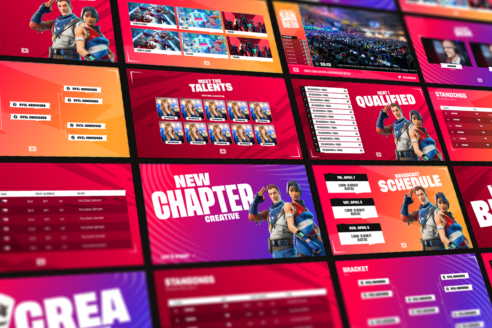
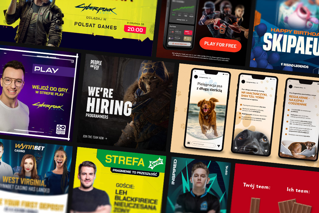
Collection of various static assets created for Google; social media graphics, email templates, thumbnails, announcements, and more.
My Role
Design


the approach
Keeping it Simple
As a designer, my approach to working within Google's brand is to embrace the company's core principles of simplicity, functionality, and cleanliness. One of the most recognizable quadruple color schemes, an iconic and elegant font, and an emphasis on informativity and transparency — this is what separates regular designs from the Google ones.
Whenever I work on any graphics or other types of assets for Google, I always aim to strike a balance between innovation and familiarity. I usually take inspiration from Google's established visual patterns and apply them to my designs — this then allows users to connect effortlessly with the brand while engaging with new graphics and information.


the process
Designing the Google Way
Regardless of the type of assignments I have tackled in the past, each project became a place where tradition met its custom needs. A well-placed typography, proper colors, and correct layout choices resulted in graphics that speak to users both old and new.
A good eye for detail and a deep understanding of core design principles ensured the brand identity was present across all types of assets — from email templates and landing pages to static graphics and event announcements. The over-narrative of the brand was always at the center stage: I didn't just aim to make things look good, I made sure they felt like Google.


