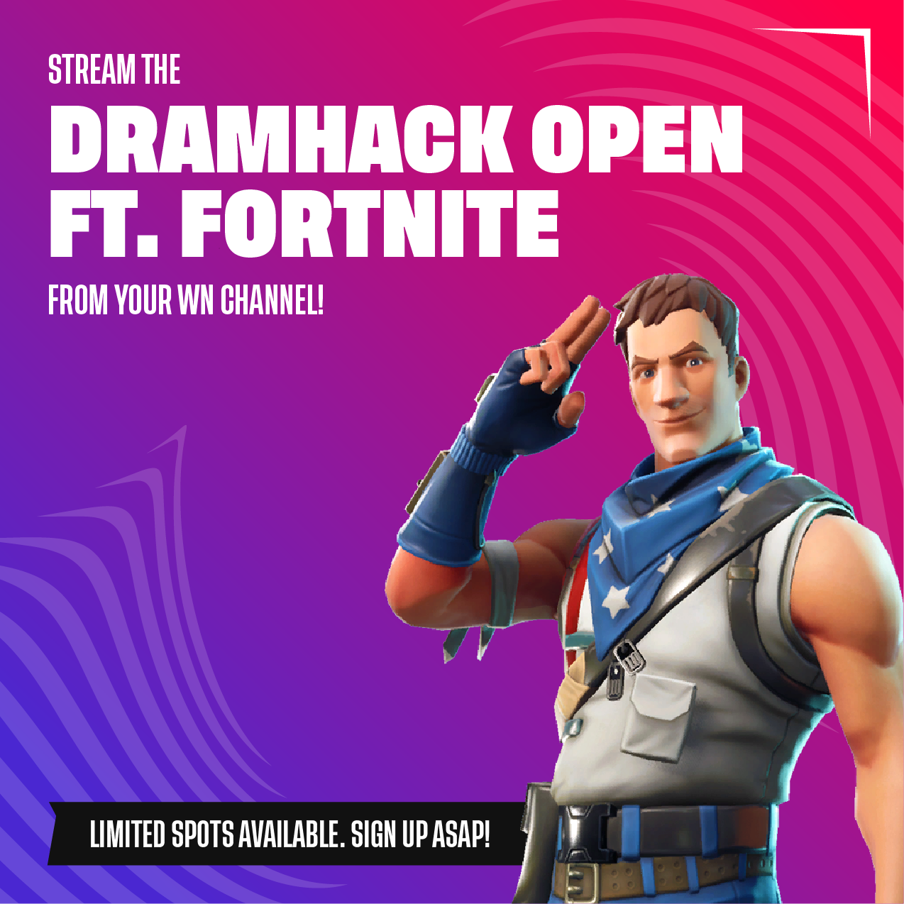
DreamHack ft. Fortnite
(on behalf of ESL GAMING POLSKA​​​​​​​)
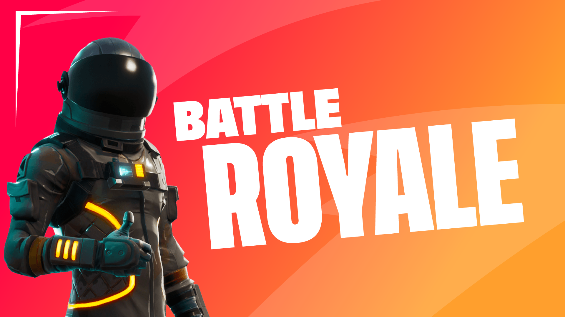
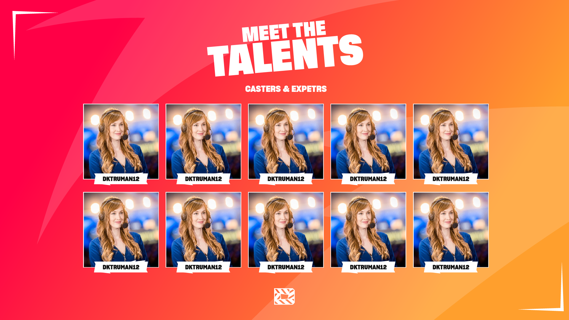
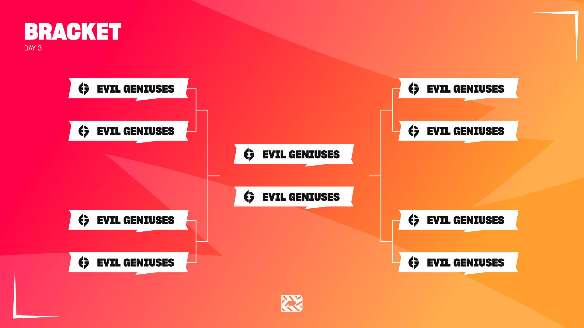
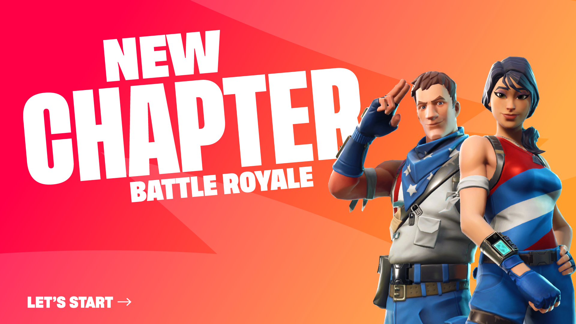
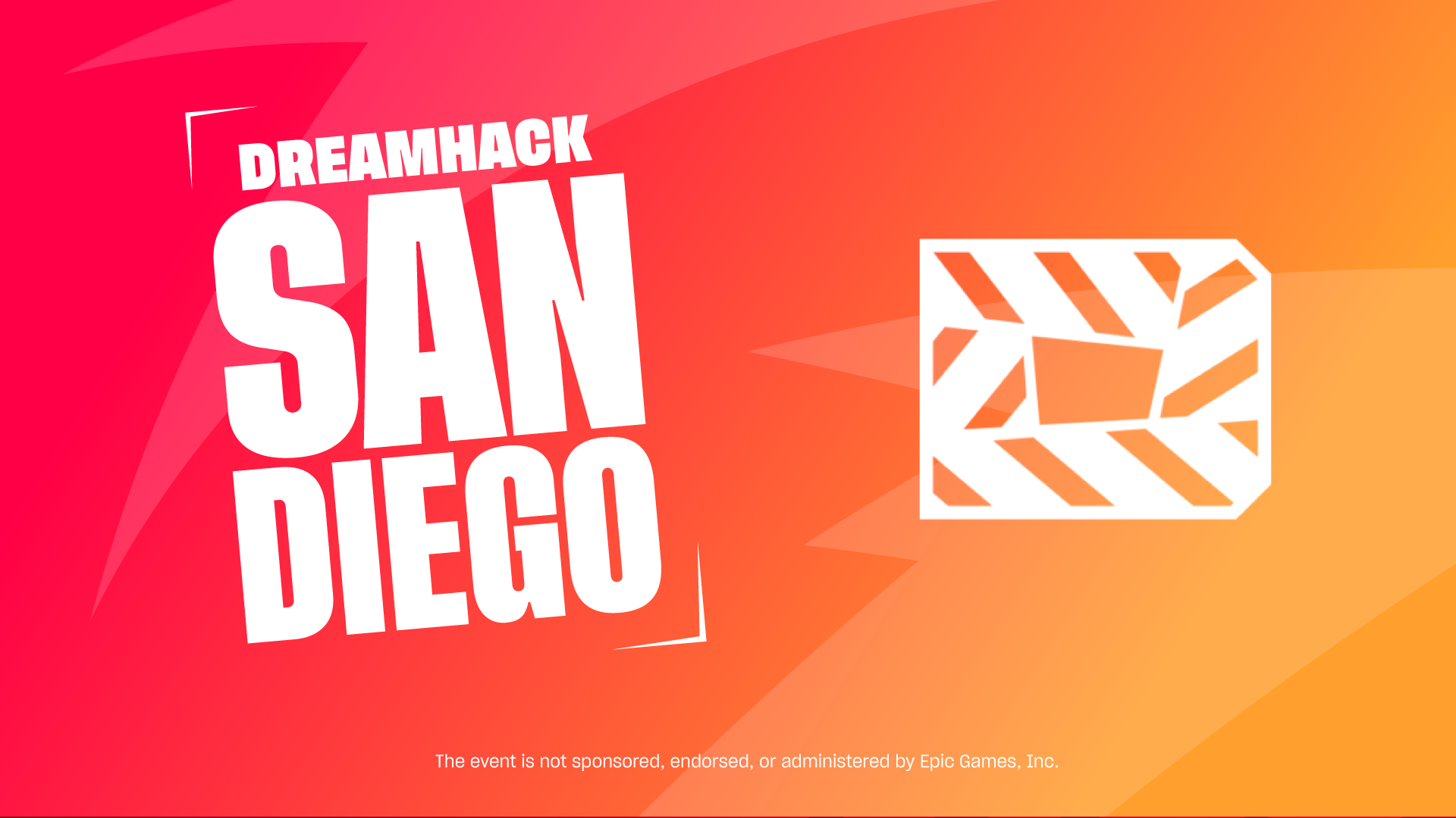
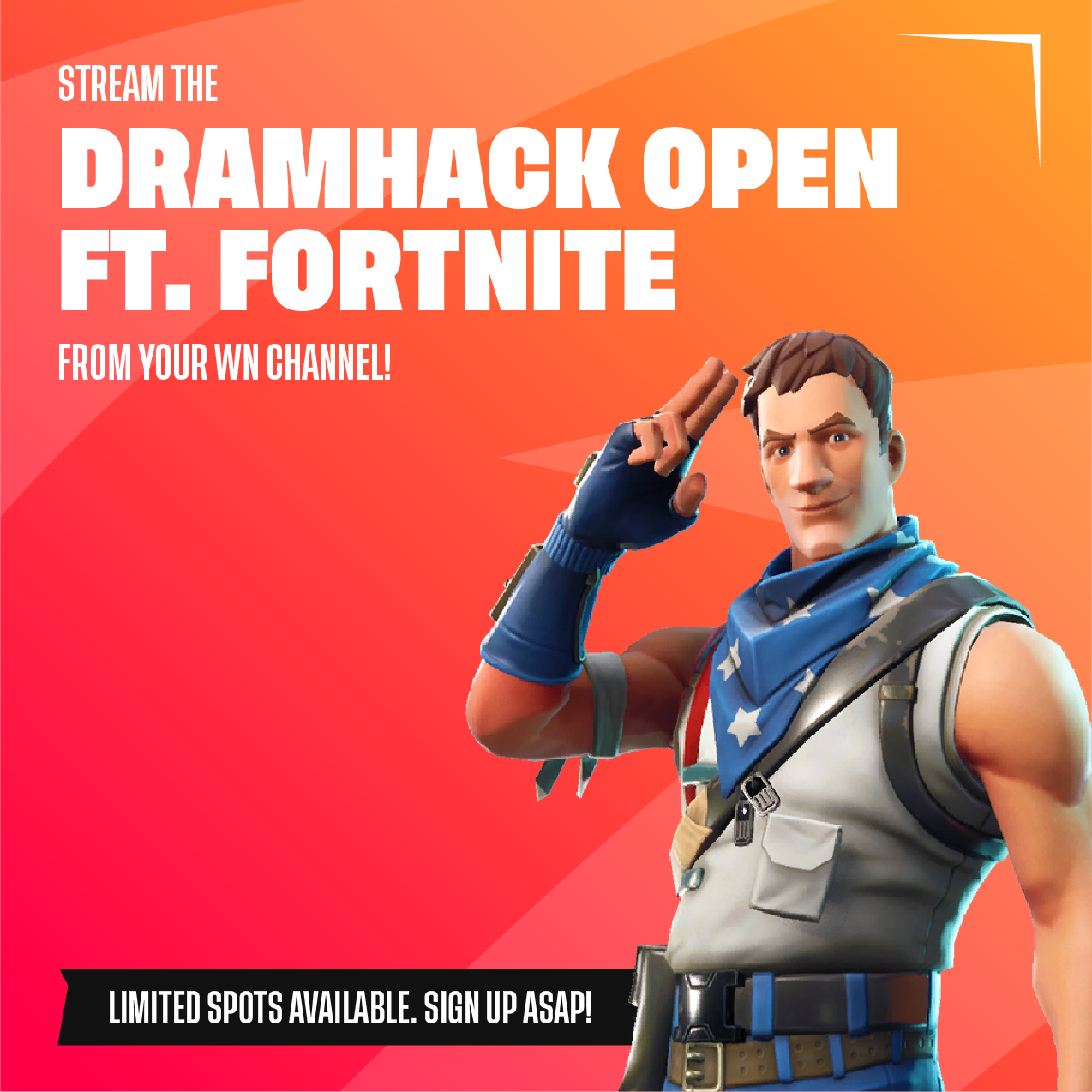
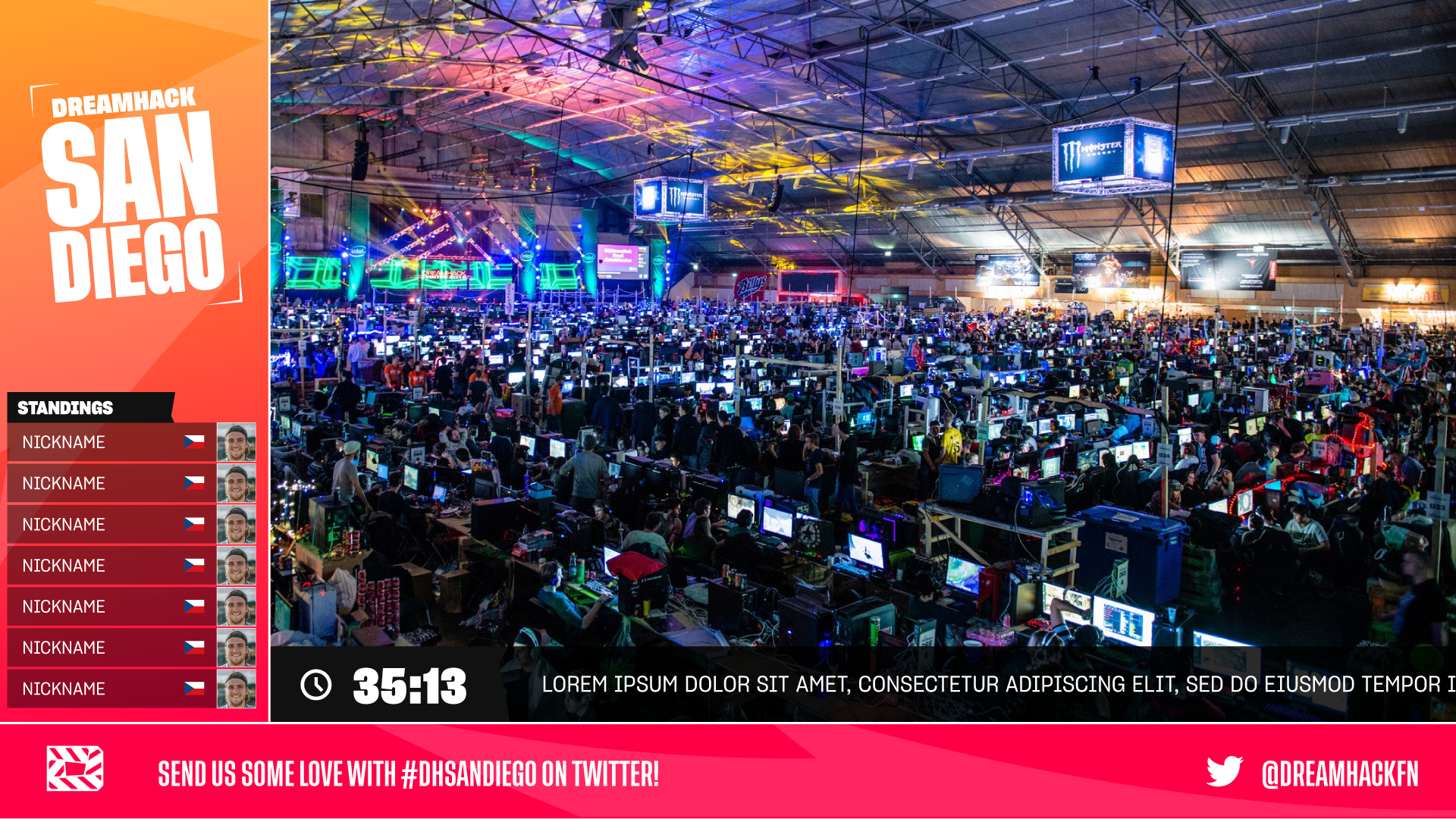
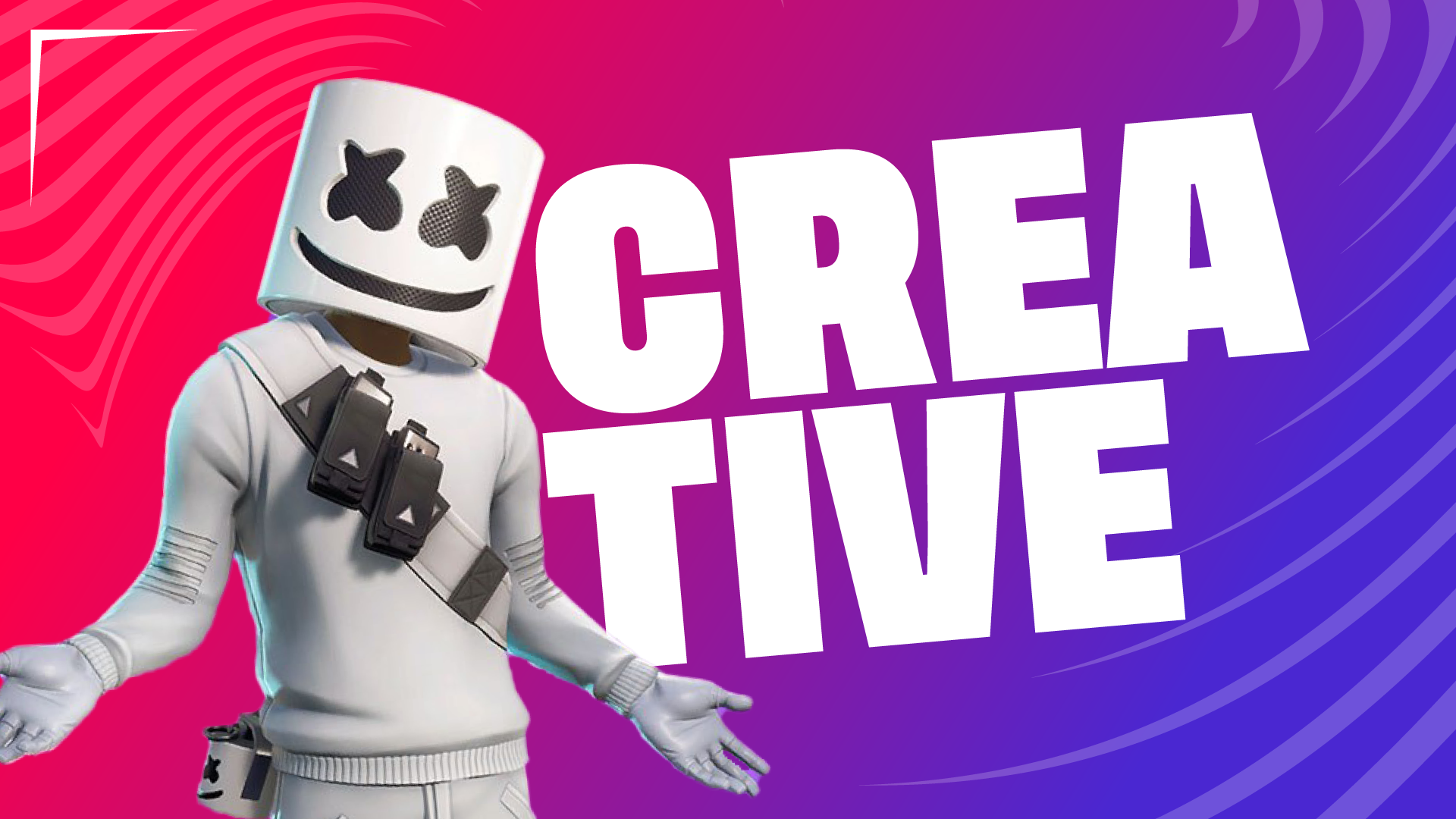
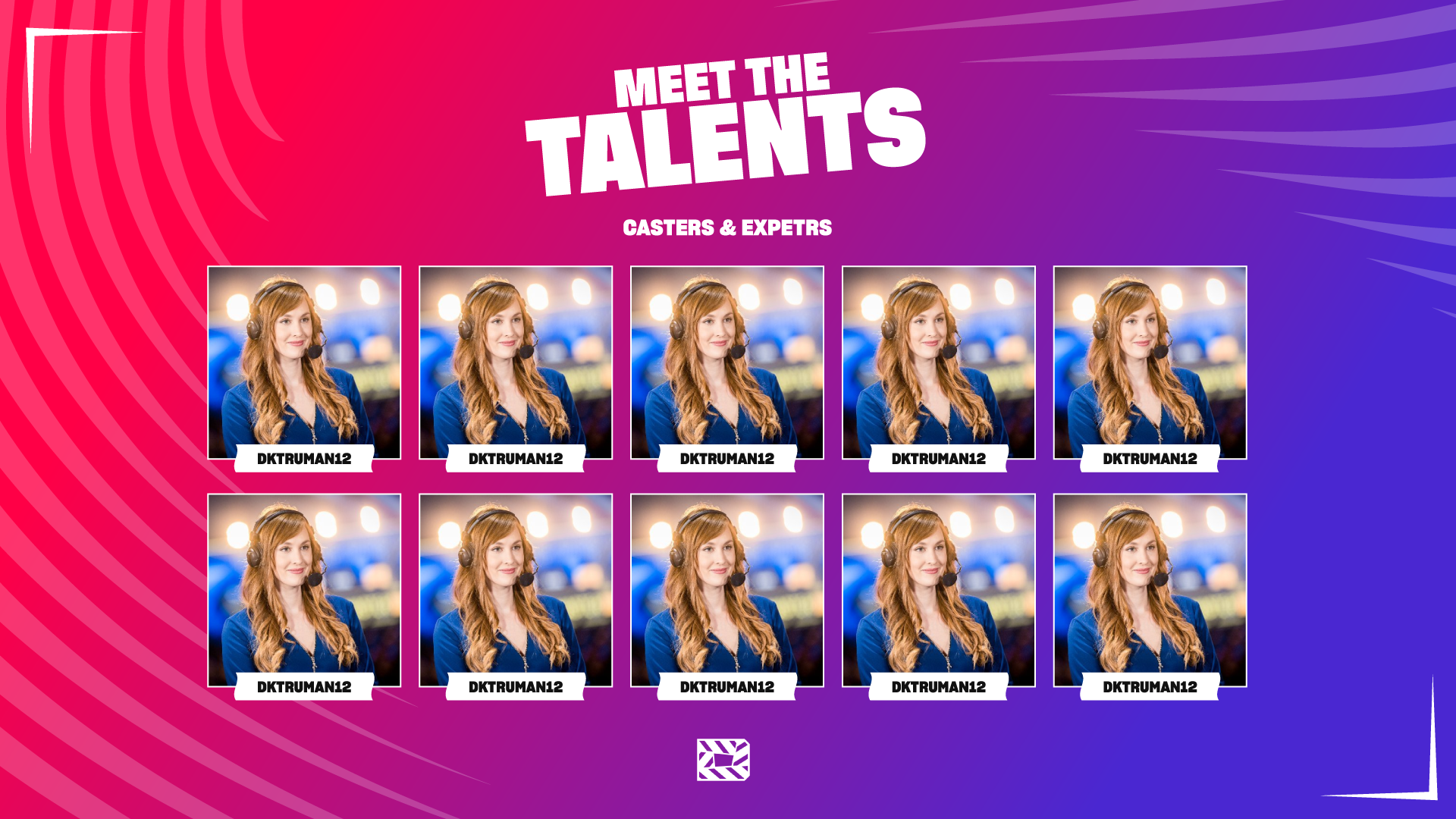
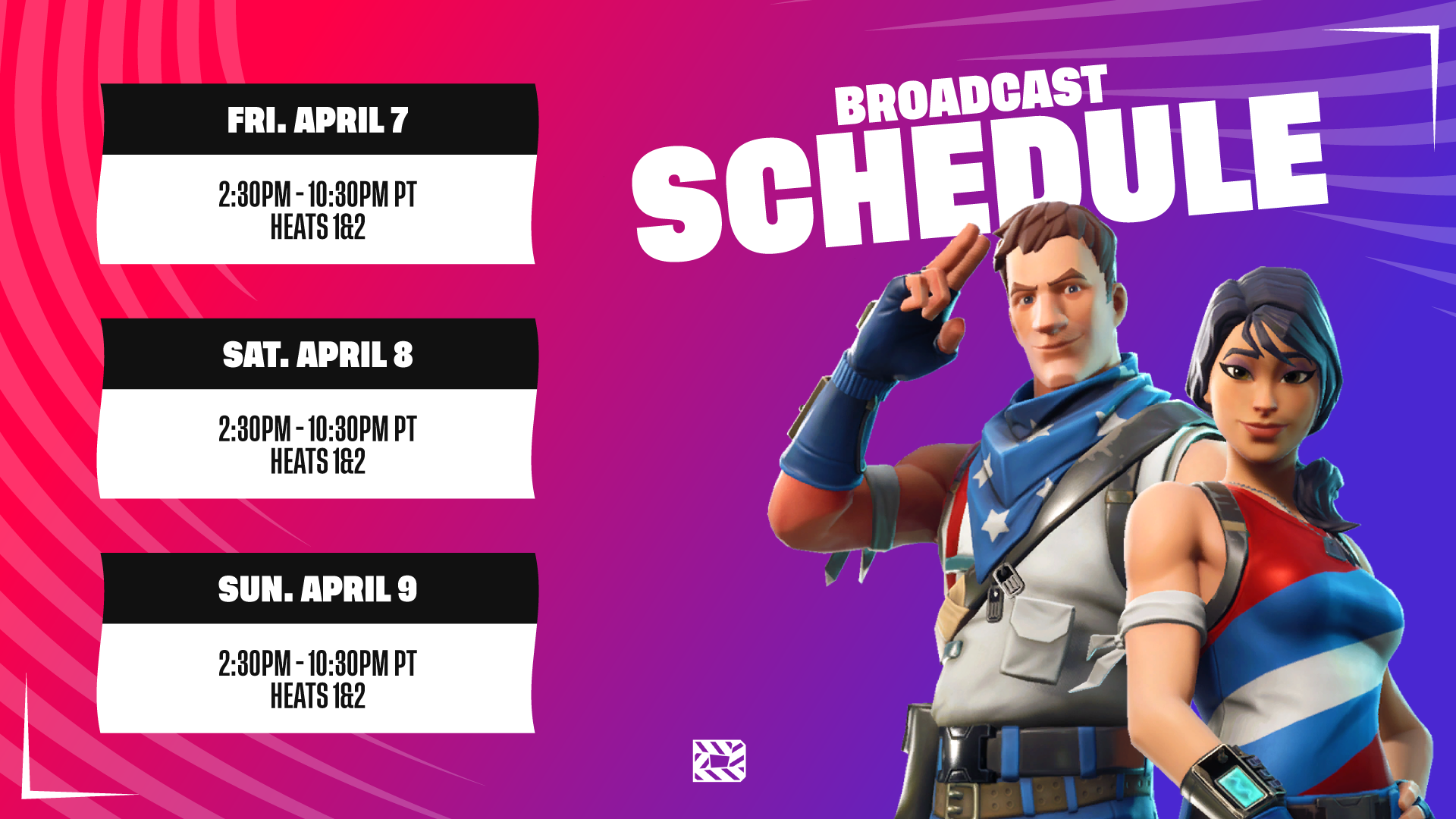
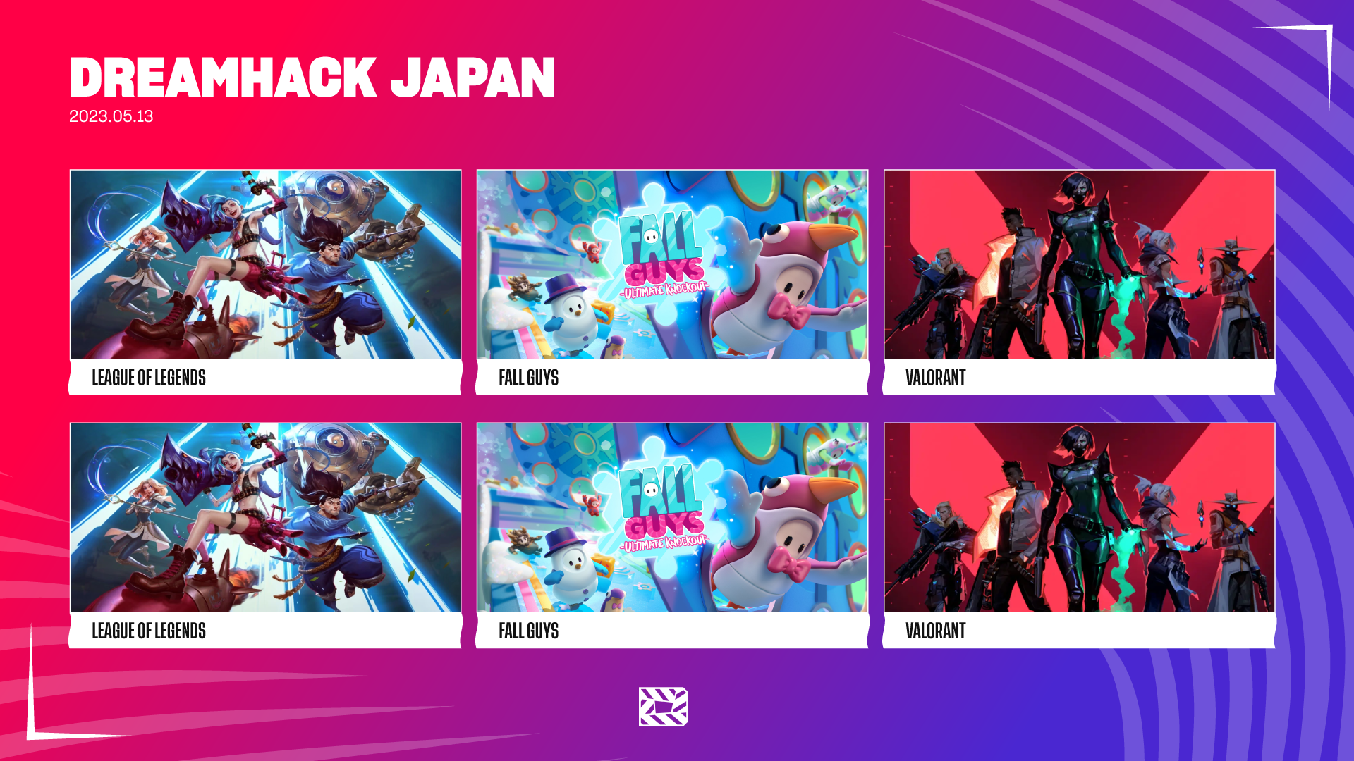
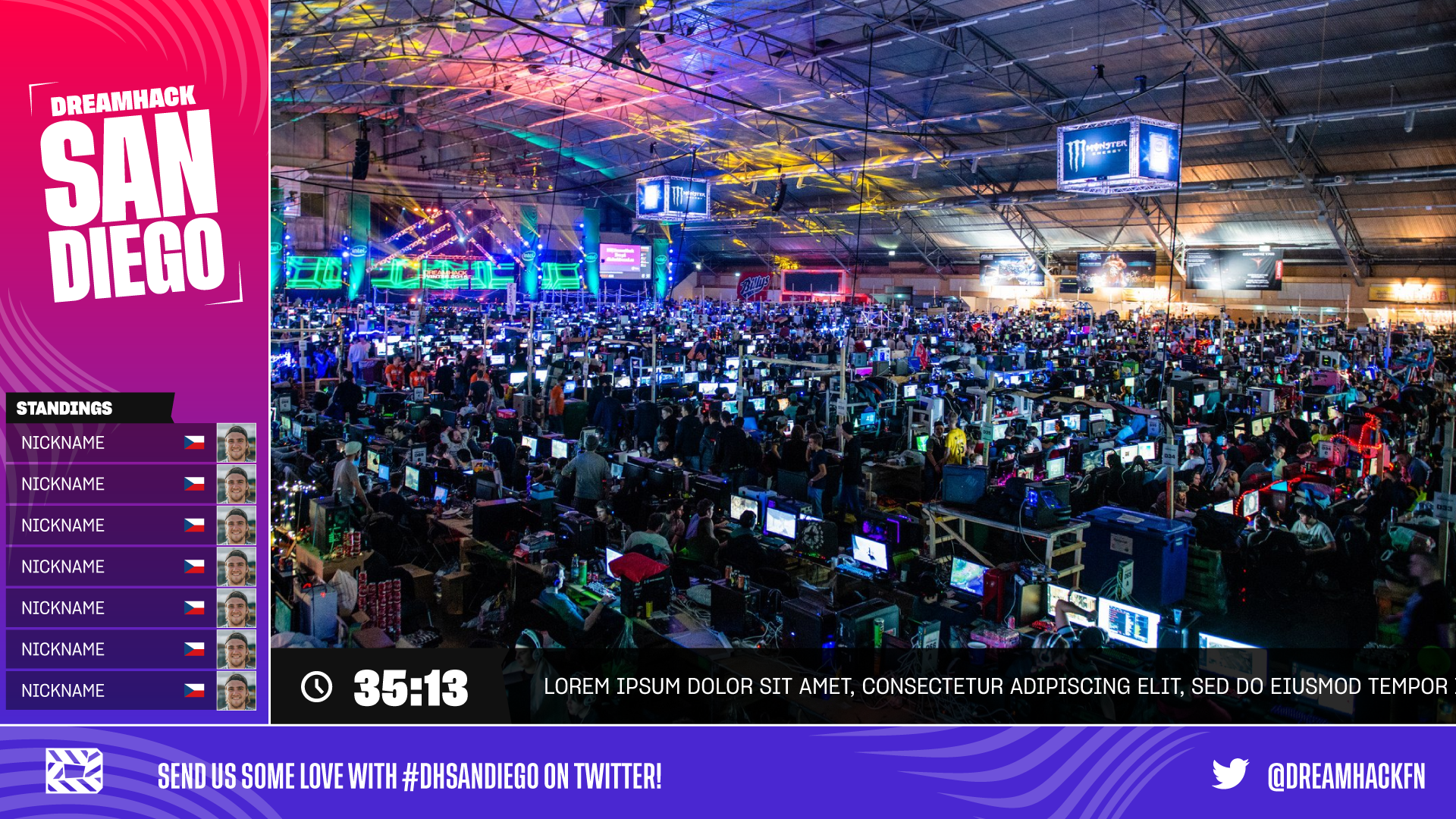
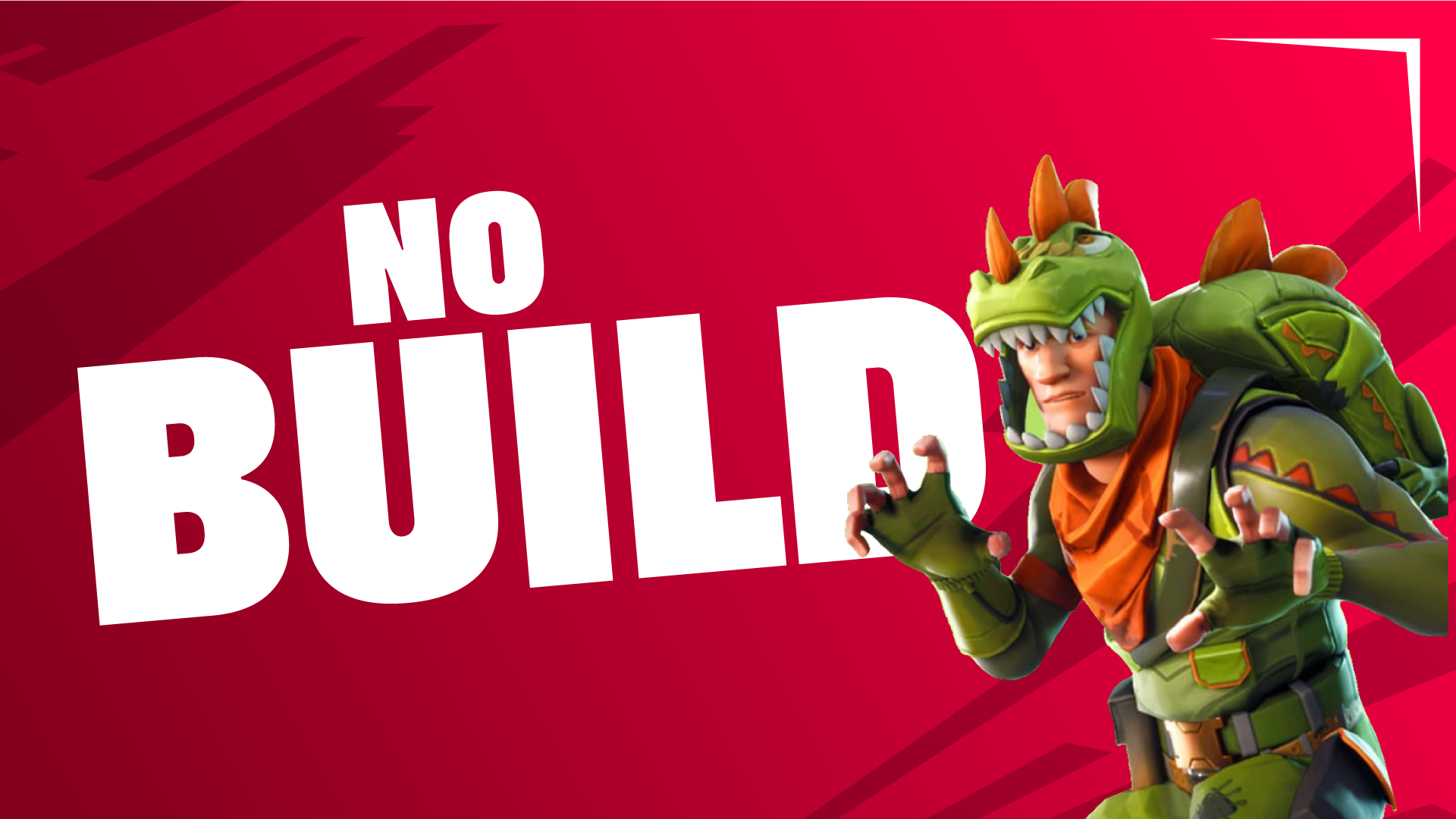
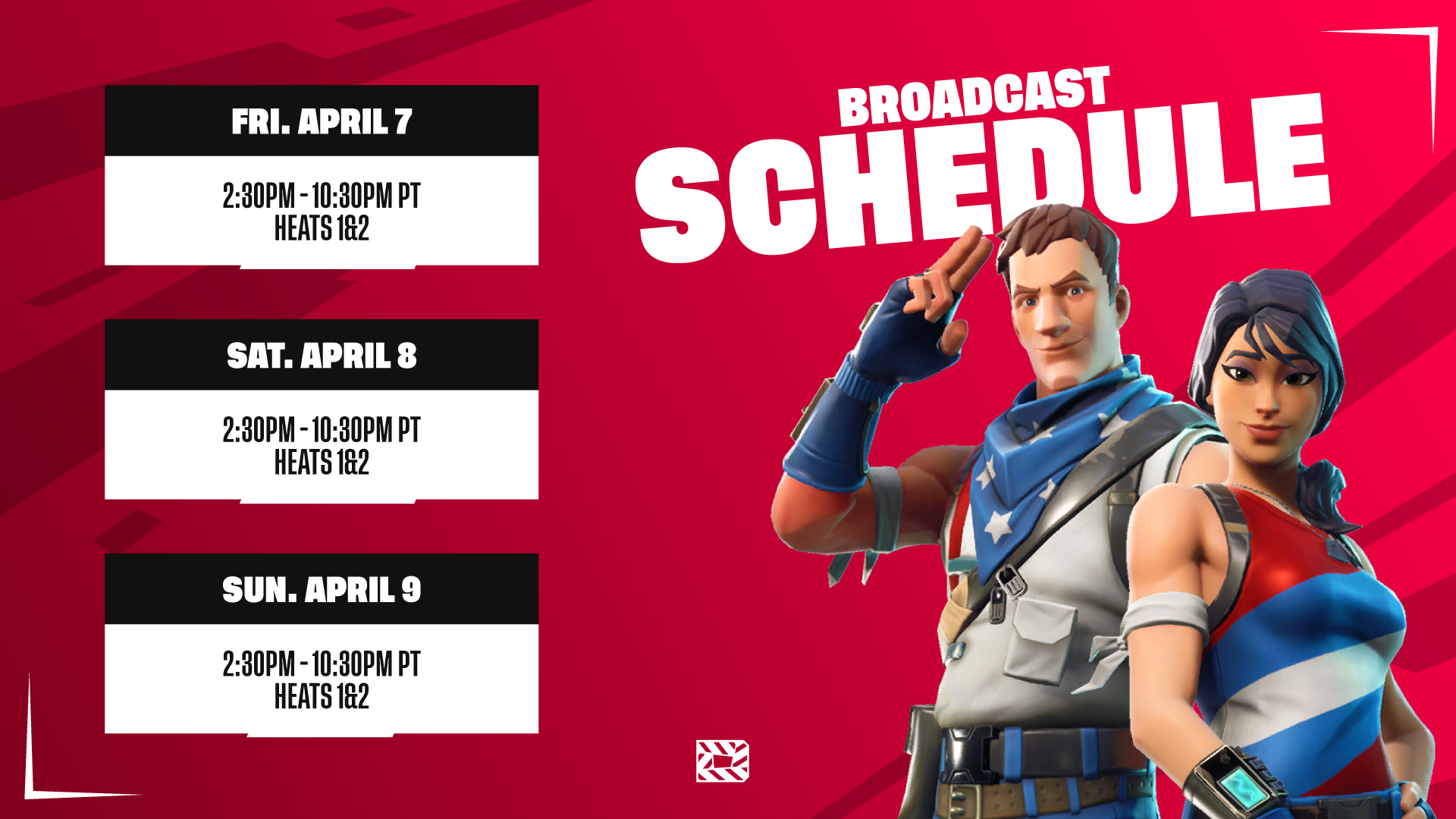
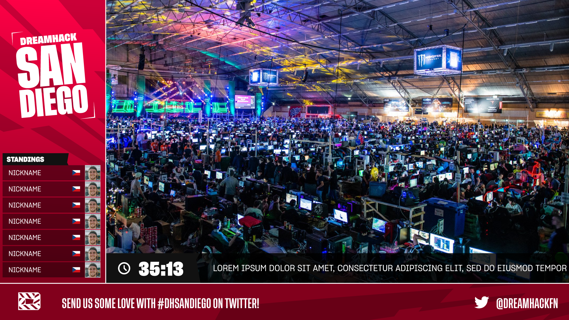
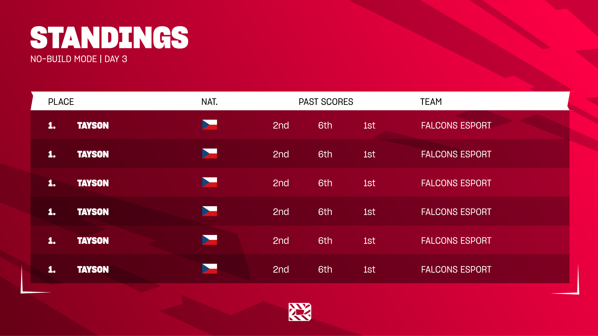
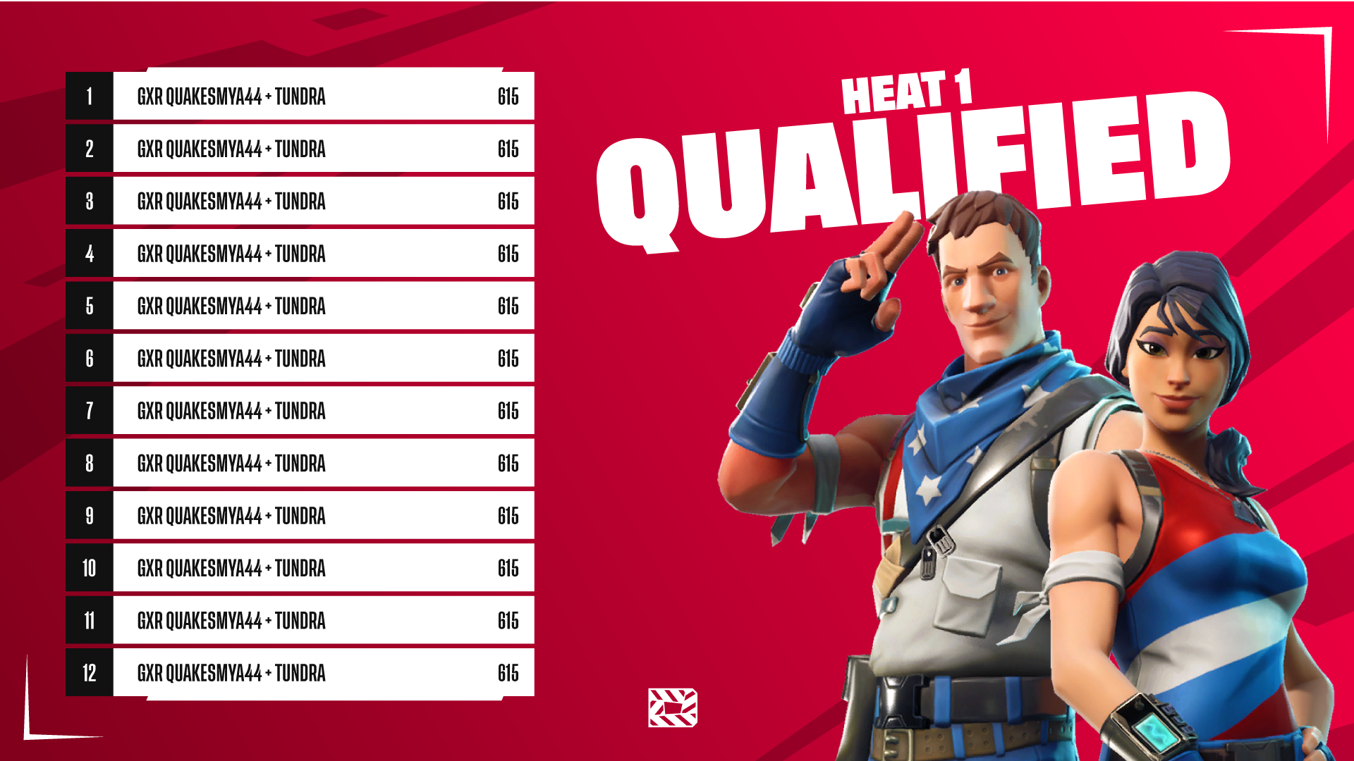
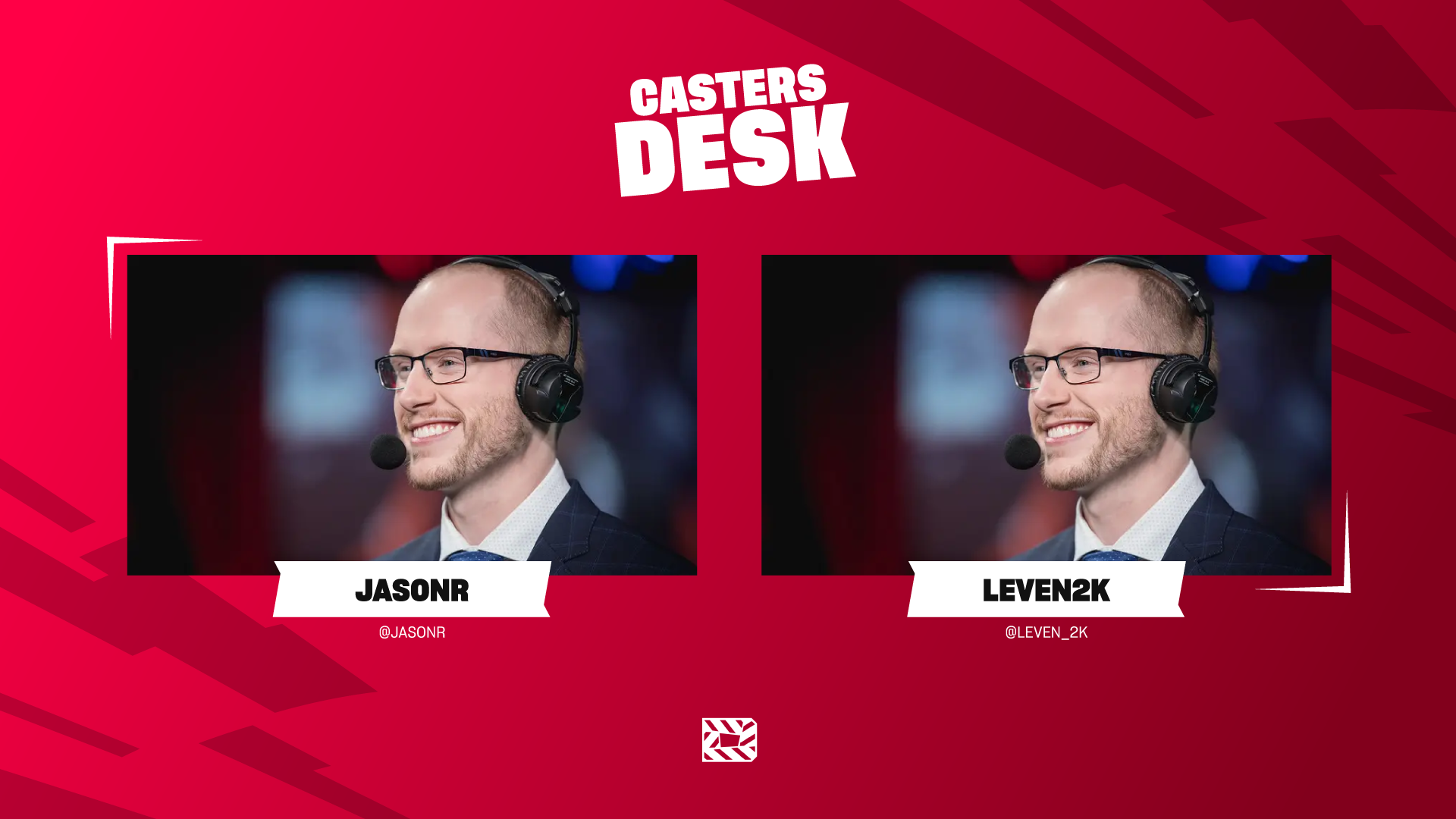
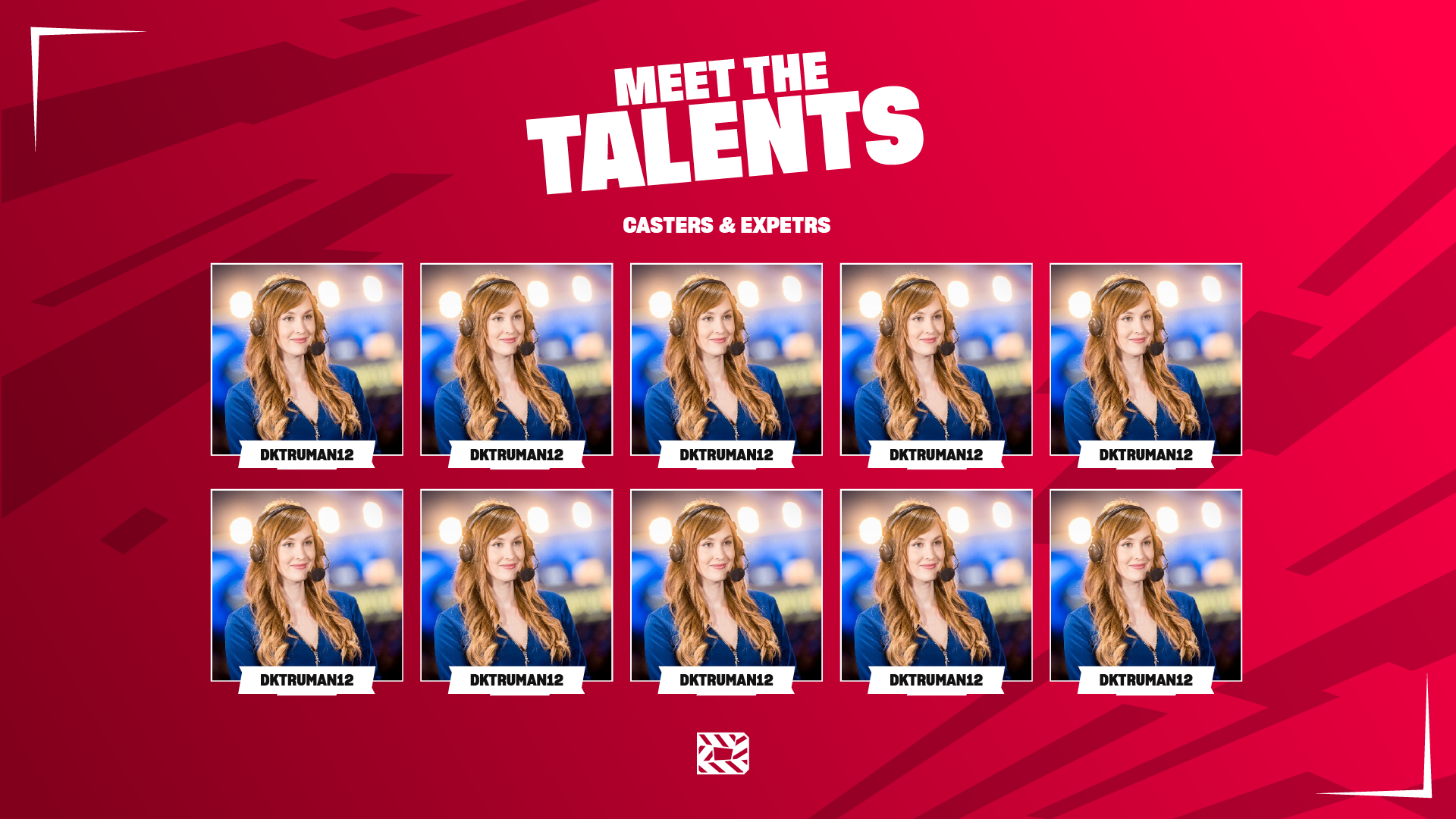
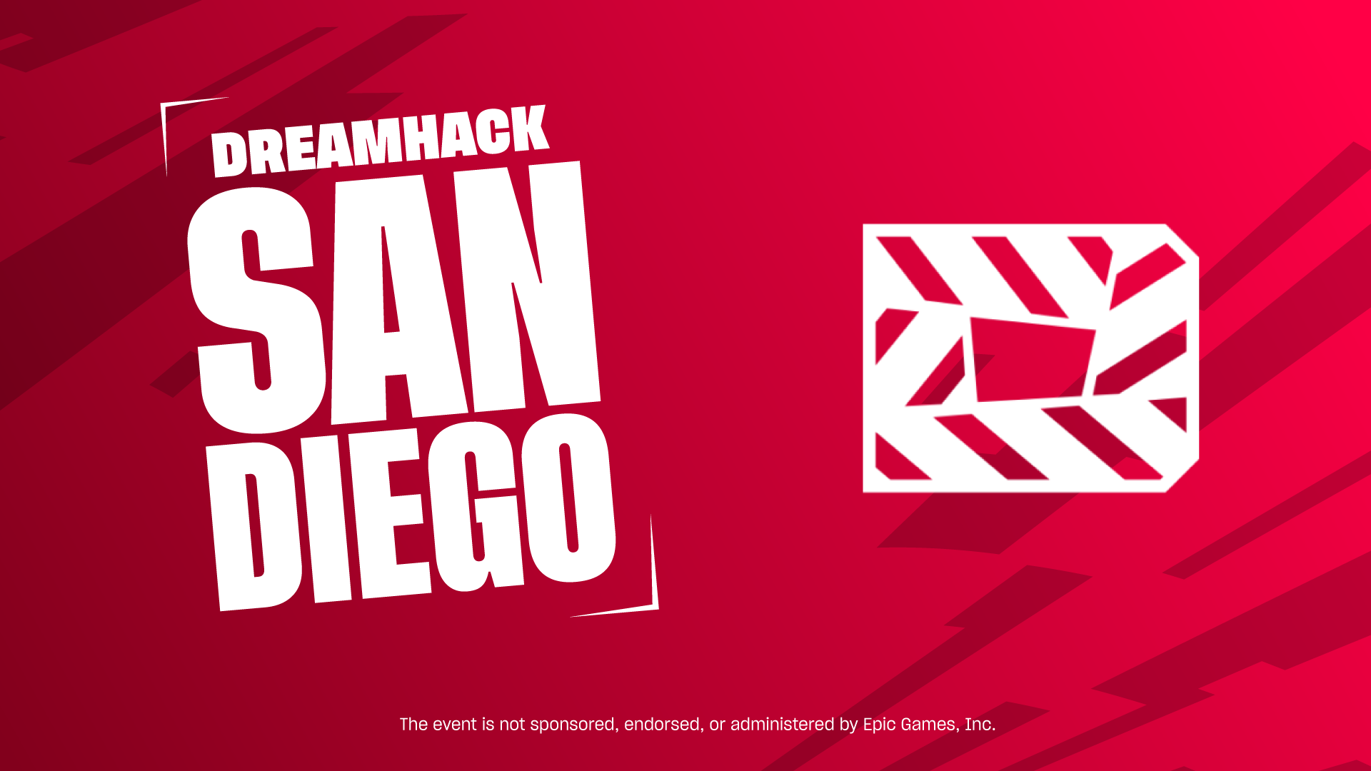
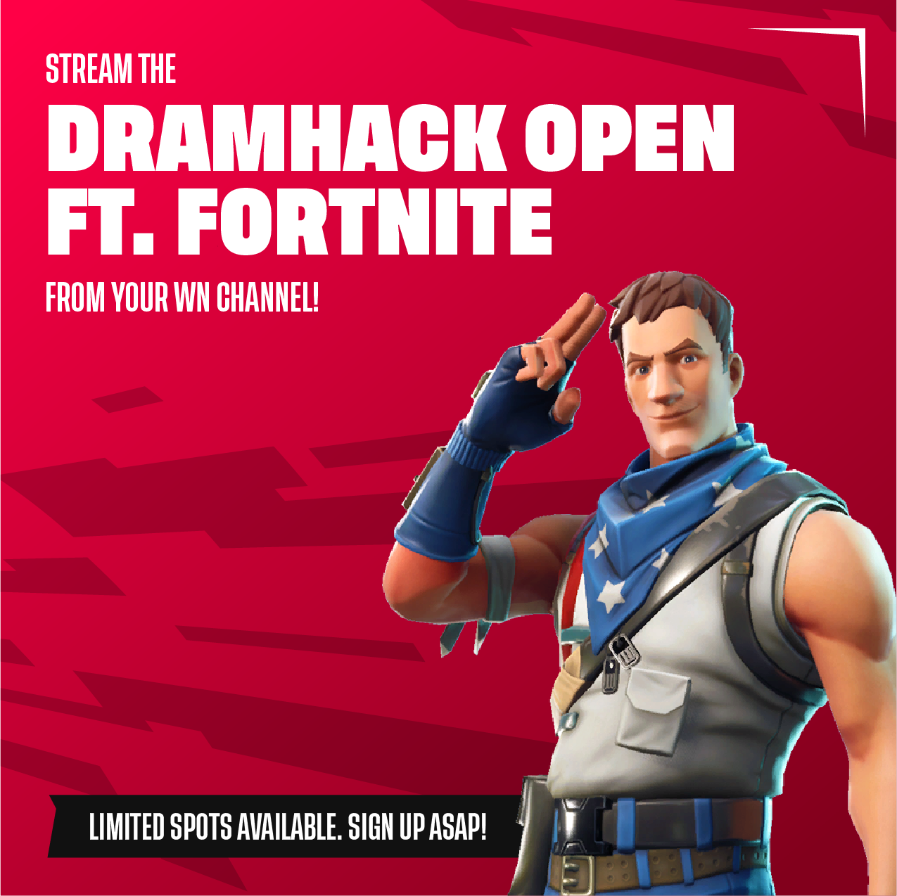
Visual identity for an esports tournament series — DreamHack Open ft. Fortnite. A mixture of DreamHack's and Fortnite's aesthetics in three different sub-brands.

My Role
Brand Identity
the challenge
Three in One
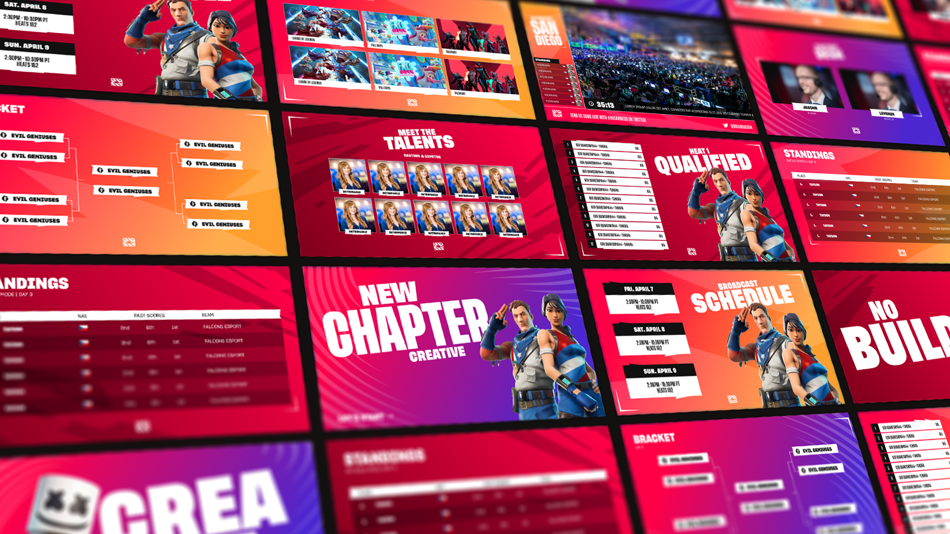
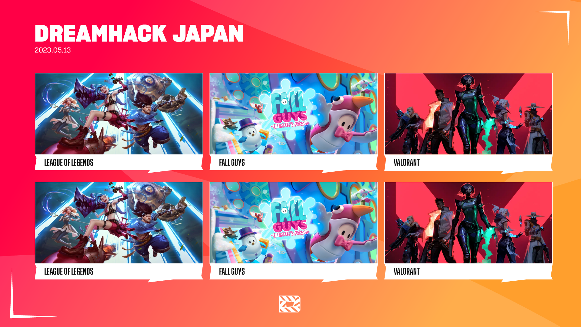
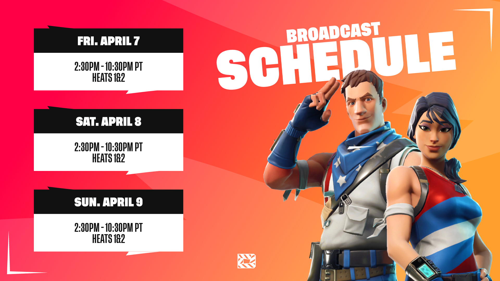
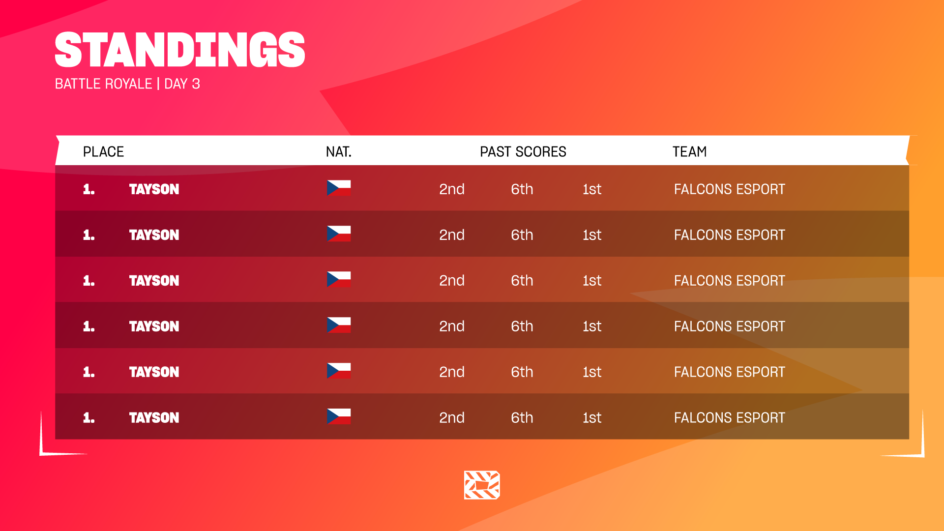
While working on this project with ESL Gaming Polska, my job was to combine two distinct identities the one of DreamHack and of Fortnite—​​​​​​​ to create a brand new vision for a series of Fortnite tournaments. 
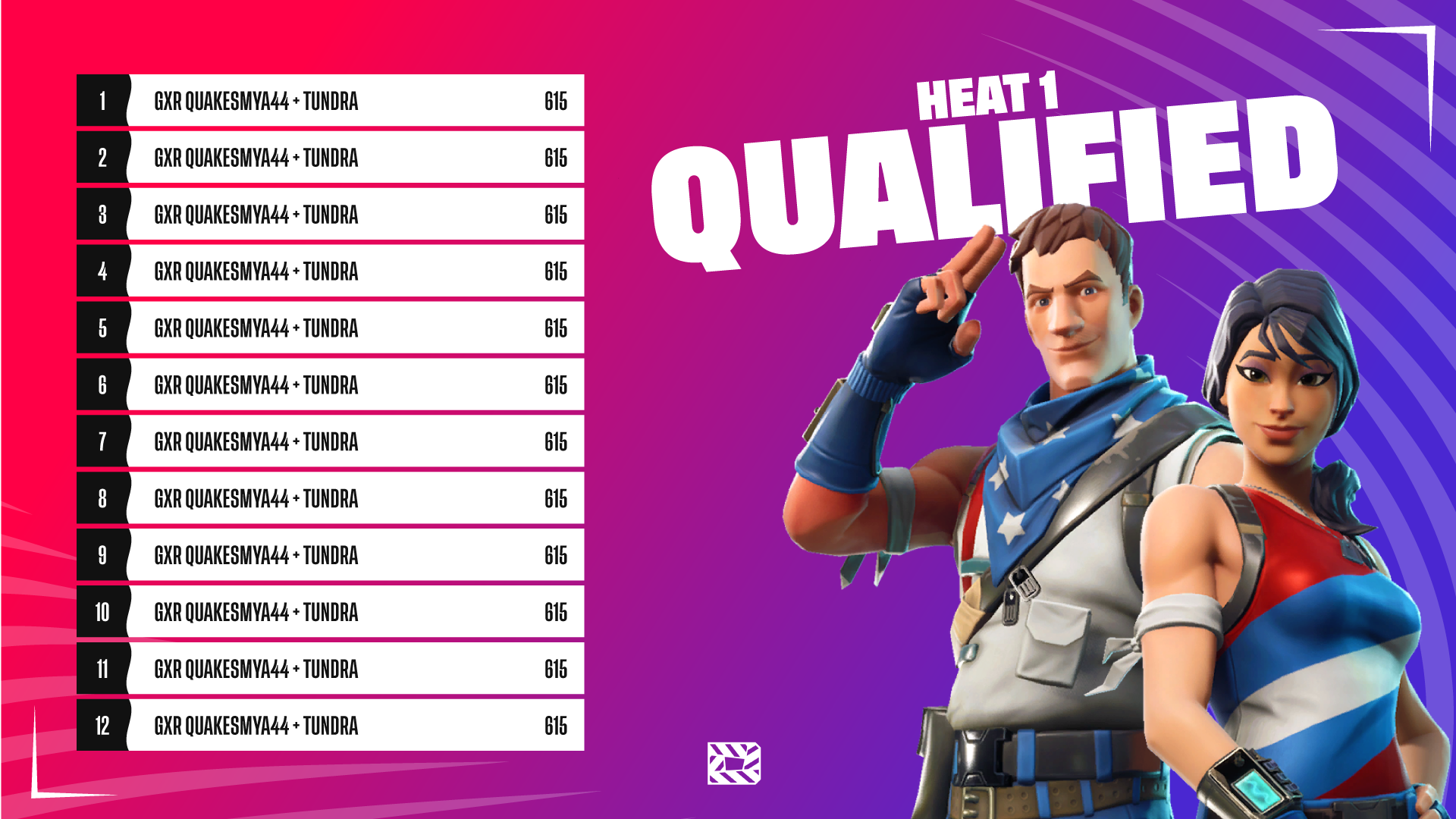
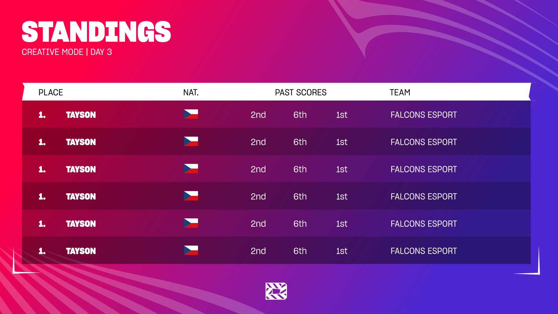
In shaping this new trademark, I was faced with the challenge of designing three interconnected sub-brands, each tailored to a different game mode within Fortnite: Creative, Battle Royale, and No-Build.

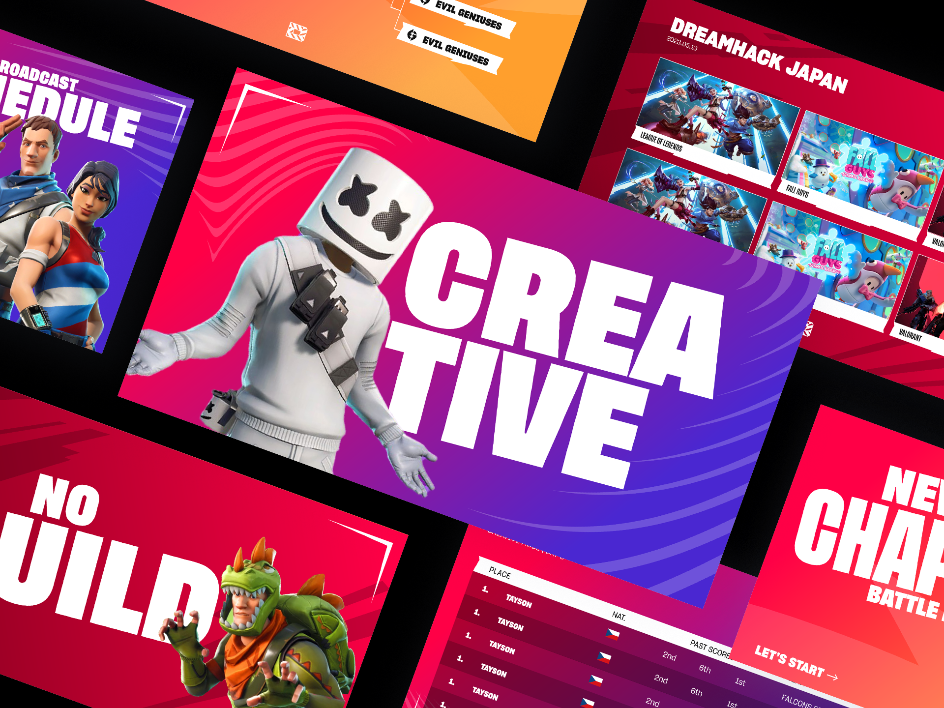
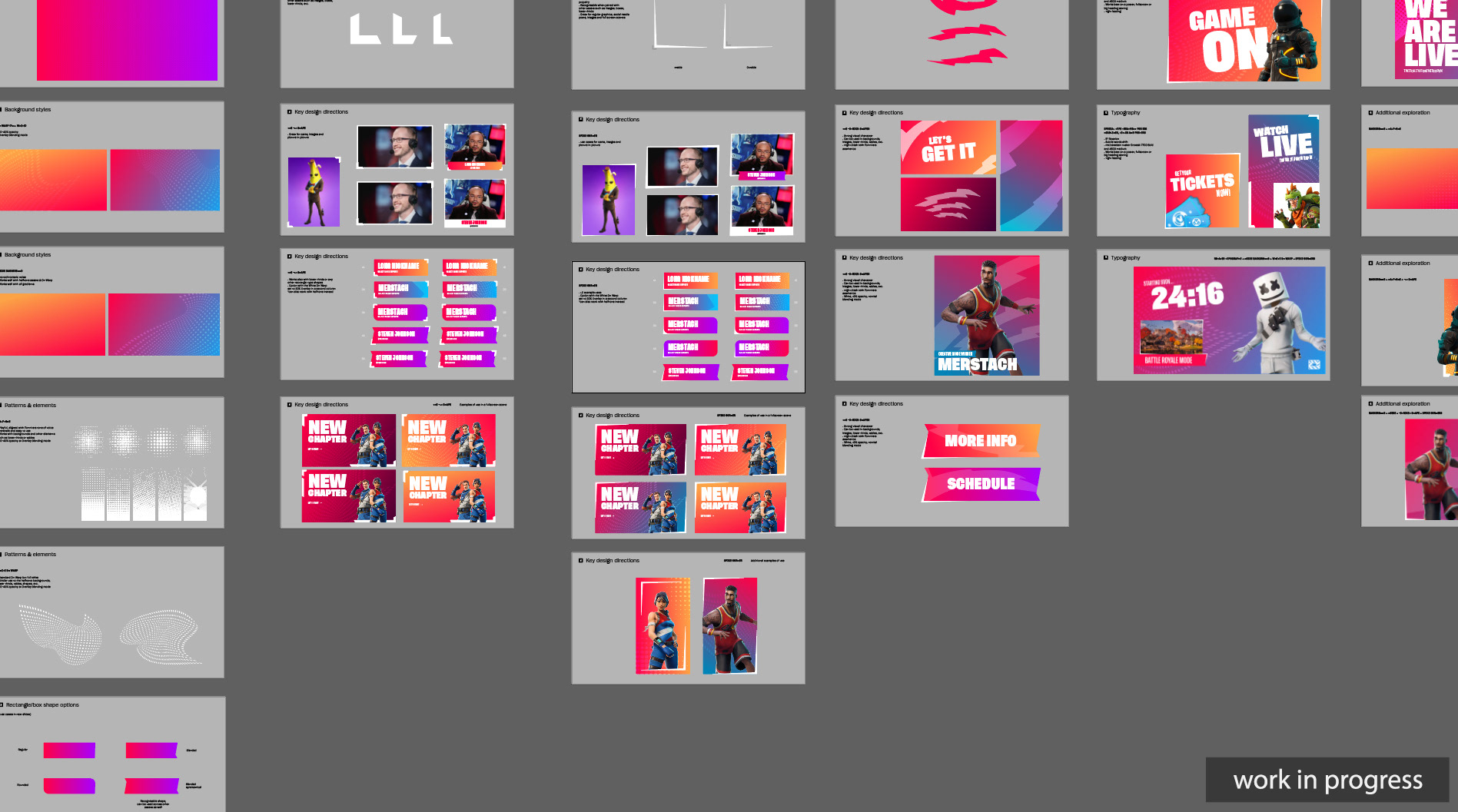
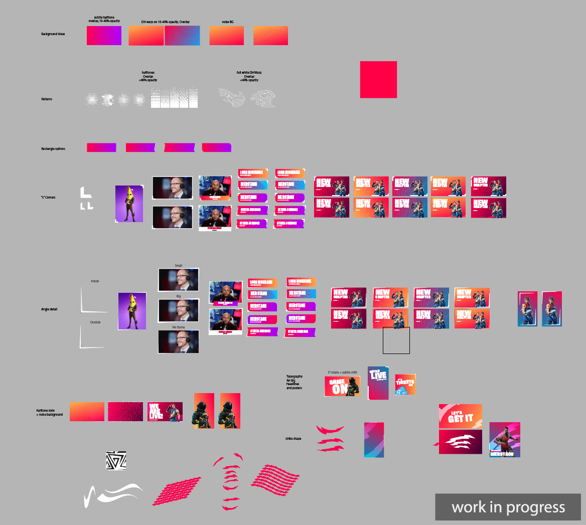
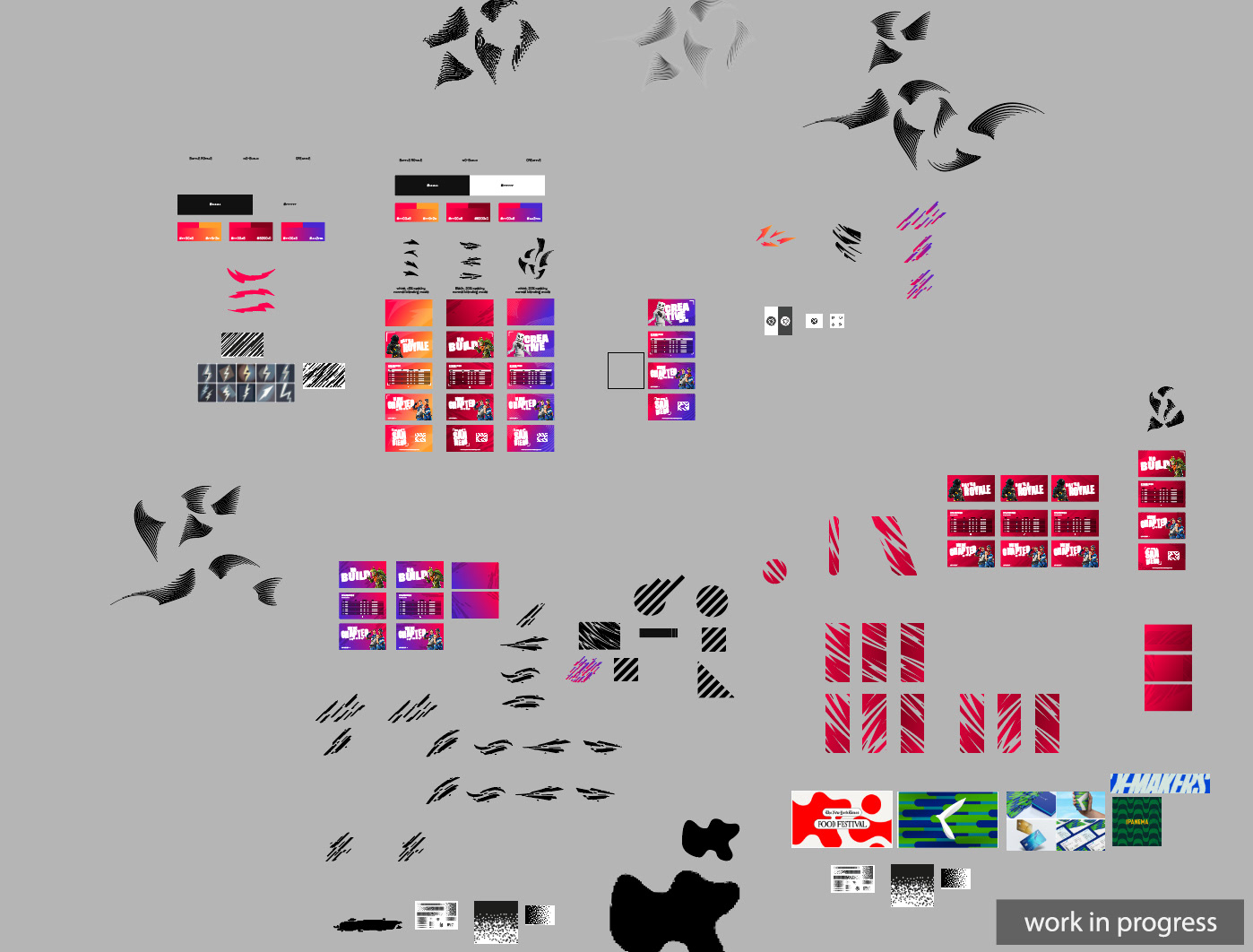
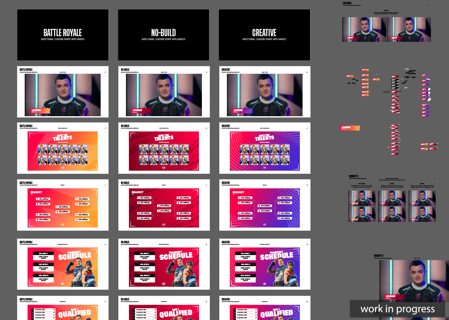
Each mode required a unique aesthetic that resonated with its gameplay style while staying true to the overarching brand narrative. Experimenting with different color palettes, typography choices, and graphical elements can lead to unforeseen visual clashes and other problems that need solving. Thankfully, dedication, multiple design explorations, and amazing feedback from the ESL team were what kept me going and ultimately allowed me to deliver a well-polished and aesthetic brand package.
the approach
An Essence of Gaming Identity
For the first and most fundamental of the game modes — Battle Royale —​​​​​​​ I managed to find the right visual balance that conveyed DreamHack's energy paired with Fortnite's fierce competition.
By basing my approach on Fortnite-like shapes and familiar colors, I ensured that the aesthetic served as a backbone to the entire event — conveying the essence of both brands and the thrilling last-man-standing battles of the game.
next up
Crafting Creativity
The Creative Mode visuals on the other hand showcased an imaginative spark and playful artistic colors that blended perfectly with the mode's major features. The palette choice played a crucial role here —​​​​​​​ a mix of cherry red and vibrant purple gave this sub-brand a distinctively charming and welcoming feel. This quality was especially important as it captured the essence of players competing on custom community-made maps — levels that often were quite crazy, unconventional and, well, pretty creative.
one last step
Completing the Blueprint
The final challenge was in shaping the No-Build game mode, which marked a departure from conventional gameplay. The key takeaway for this option was that it was all about the absence of building (a key ability in the game) —  thus the dominant red gradient that hints at something canceled or removed, as well as the blocky and defragmented aesthetic which successfully captures the essence of the No-Build mode.

As I neared the end of the process, the hard work started to pay off. It was a moment of excitement and relief as I saw the final versions of the three sub-brands taking shape — especially given a quite tight deadline and a vast range of work.

In the end, a unique design application has been given to all three sub-branches. All the identities were interconnected yet visibly different — something that was a key focus and a challenge for this assignment. ESL's feedback during the process was very helpful and informative, it helped me steer in the right direction and eventually finish the project within a very narrow timeframe.

Other Projects

Back to Top